Mosaic Plot
This is a Plot
- it’s a visualization of information from Contingency Tables
- it’s similar to a Bar Chart, but shows more information
- uses areas to represent this information
R
Add data
library(openintro)
data(email)
One variable
```text only tab1 = table(email$number) mosaicplot(tab1, col=c(‘yellow2’, ‘skyblue2’, ‘red’), main=’Numbers in emails’)
<img src="http://habrastorage.org/files/5d6/3a9/1dd/5d63a91dd2be45e499aeacedb579328e.png" alt="Image">
```bash
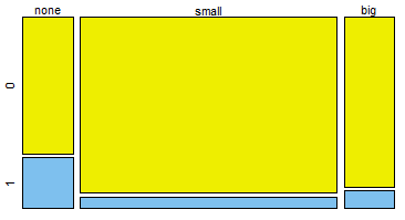
tab2 = table(email$number, email$spam)
mosaicplot(tab2, col=c('yellow2', 'skyblue2'),
main='Numbers in emails vs spam/not spam')