Q-Q Plot
Probability Plot
A Probability plot is a technique for comparing two data sets
- e.g. two empirical observations
- or empirical set vs theoretical set
Commonly used:
- P-P plot, “Probability-Probability” or “Percent-Percent” plot;
- Q-Q plot, “Quantile-Quantile” plot, which is more commonly used.
Normal Probability Plot
It’s a special case of Q-Q plots:
- a Q-Q plot against the standard normal distribution;
The normal probability plot is formed by:
- Vertical axis: Ordered response values
- Horizontal axis: Normal order statistic medians or means (see rankit [https://en.wikipedia.org/wiki/Rankit])
Constructing
- order the observations
- determine the percentile for each
- identify the $z$-score for each percentile
- create a Scatterplot
- observation (vertical) vs
- $z$-score (horizontal)
if the data is normally distributed, $z$-scores on the horizontal axis should approximately correspond to their percentiles
R
Example 1
Evaluating the Normal Distribution (see [http://rpubs.com/agrigorev/21480])
load(url("http://www.openintro.org/stat/data/bdims.RData"))
fdims = subset(bdims, bdims$sex == 0)

qqnorm(fdims$hgt, col="orange", pch=19)
qqline(fdims$hgt, lwd=2)
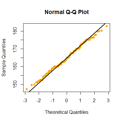
Does it look similar to real Normal Distribution?
- it does
- let’s simulate the normal distribution and compare
```text only set.seed(123) sim.norm = rnorm(n=length(fdims$hgt), mean=mean(fdims$hgt), sd=sd(fdims$hgt)) qqnorm(sim.norm, col=”orange”, pch=19, main=”Normal Q-Q Plot of simulated data”) qqline(sim.norm, lwd=2)
<img src="http://habrastorage.org/files/471/d9f/11a/471d9f11a690436f96f56ad0c4c544c4.png" alt="Image">


Can try to plot several simulations

```tera term macro
qqnormsim = function(dat, dim=c(2,2)) {
  par(mfrow=dim)
  qqnorm(dat, main="Normal QQ Plot (Data)")
  qqline(dat)
  for (i in 1:(prod(dim) - 1)) {
    simnorm <- rnorm(n=length(dat), mean=mean(dat), sd=sd(dat))
    qqnorm(simnorm, main = "Normal QQ Plot (Sim)")
    qqline(simnorm)
  }
  par(mfrow=c(1, 1))
}
qqnormsim(fdims$hgt)

Looks like it’s indeed normal
Example 2
(Same data set as in example 1)
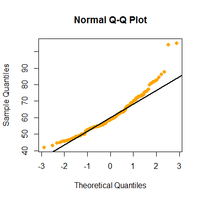
Let’s take a look at another dataset
```text only hist(fdims$wgt)
<img src="http://habrastorage.org/files/600/799/aa1/600799aa1fd24b03beed1d063fd7cb0f.png" alt="Image">

Looks a bit skewed

```text only
qqnorm(fdims$wgt, col="orange", pch=19)
qqline(fdims$wgt, lwd=2)
text only
qqnormsim(fdims$wgt)
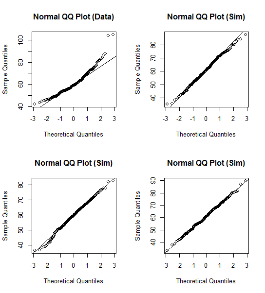
Most likely not normal
Sources
- OpenIntro Statistics (book)
- https://en.wikipedia.org/wiki/Q-Q_plot
- https://en.wikipedia.org/wiki/Normal_probability_plot