R Visualization Snippets
Scatter Plots
Labels and Grids
```text only x = c(2, 6, 7, 1, 8, 2, 5, 7) y = c(3, 5, 1, 1, 1, 2, 3, 4) l = c(‘A’, ‘B’, ‘C’, ‘D’, ‘B2’, ‘E’, ‘F’, ‘G’)
plot(NULL, NULL, bty=”n”, ylim=c(1-0.3, 5+0.3), xlim=c(1-0.3, 8+0.3), xaxt=”n”, xlab=”x”, ylab=”y”)
- grids abline(h=1:10, v=1:10, col=”gray”, lty=3)
axis(side=1, at=1:8) points(x, y, col=”red”, pch=19) text(x + 0.3, y, labels=l, cex=0.7)
<img src="http://habrastorage.org/files/674/eca/b8c/674ecab8caee446b86526a6778e7e0b0.png" alt="Image">

### Circles Around Dots

Same code as for the previous example, with the following:

```tera term macro
pallete = rainbow(n, s=1, v=1, start=0, end=max(1, n-1)/8, alpha=0.5)
symbols(x, y, circles=rep(0.2, n), bg=pallete, add=T, inches = FALSE)

Scatter Plot and Box Plots
```text only oldpar = par(no.readonly = TRUE) data(mtcars) attach(mtcars)
-
fig=c(x1, x2, y1, y2) par(fig=c(0, 0.8, 0, 0.8))
- mar=c(bottom, left, top, right)
- default: c(5, 4, 4, 2) + 0.1. par(mar=c(4, 4.1, 0, 0)) plot(mtcars$wt, mtcars$mpg, xlab=”Miles Per Gallon”, ylab=”Car Weight”, col=”darkblue”, pch=19)
par(fig=c(0, 0.8, 0.8, 1), new=TRUE) par(mar=c(0, 4.1, 0, 0)) boxplot(mtcars$wt, horizontal=TRUE, axes=FALSE)
par(fig=c(0.8, 1, 0, 0.8), new=TRUE)
par(mar=c(4, 0, 0, 0)) boxplot(mtcars$mpg, horizontal=F, axes=FALSE)
par(oldpar)
<img src="http://habrastorage.org/files/ee0/b85/076/ee0b85076e6048e0abf716e00176eb9b.png" alt="Image">


## [Histogram](Histogram)s
### Best Fit [Normal Model](Normal_Distribution), Shaded
```gdscript
load(url("http://www.openintro.org/stat/data/bdims.RData"))

fdims = subset(bdims, bdims$sex == 0)

wgtm = mean(fdims$wgt)
wgts = sd(fdims$wgt)

xlim = c(min(fdims$wgt), max(fdims$wgt)) + c(-5, +5)
hist(fdims$wgt, probability=T, xlim=xlim)

x = seq(xlim[1], xlim[2], 0.5)
y = dnorm(x=x, mean=wgtm, sd=wgts)
lines(x=x, y=y, col="blue")

x1 = min(which(x >= 57))
x2 = max(which(x >= 57))

polygon(x=x[c(x1, x1:x2, x2)], y=c(0, y[x1:x2], 0), col=rgb(0,0.5,1,0.5))

If we want to shade just a part, modify slightly: ```text only x1 = min(which(x >= 57)) x2 = max(which(x <= 70))
polygon(x=x[c(x1, x1:x2, x2)], y=c(0, y[x1:x2], 0), col=rgb(0,0.5,1,0.5))
<img src="http://habrastorage.org/files/48b/7e9/bb4/48b7e9bb47d14169bff445254792508f.png" alt="Image">


[note](http://www.evernote.com/shard/s344/nl/54547539/31a15cdd-91a5-430d-84c7-8cf319e56fa6)


### Two Histograms Overlaying
```gdscript
load(url("http://www.openintro.org/stat/data/bdims.RData"))

mdims = subset(bdims, bdims$sex == 1)
fdims = subset(bdims, bdims$sex == 0)

p1 = hist(mdims$hgt)
p2 = hist(fdims$hgt)

xlim = c(min(fdims$hgt), max(mdims$hgt)) + c(-5, 5)
plot( p1, col=rgb(0,0,1,1/4), xlim=xlim)
plot( p2, col=rgb(1,0,0,1/4), add=T)

Histogram with Deviations Shown

plot(x=NA, y=NA, ylim=c(0, 0.0057), xlim=c(1200, 1800),
     xlab='point estimates of mean', ylab='density',
     main='Sampling distribuion of mean', bty='n')
m = mean(sample_means50)
s = sd(sample_means50)

rect(xleft=m-3*s, xright=m+3*s, ybottom=-1, ytop=1,
     border=NA, col=adjustcolor('blue', 0.1))
rect(xleft=m-2*s, xright=m+2*s, ybottom=-1, ytop=1,
     border=NA, col=adjustcolor('blue', 0.1))
rect(xleft=m-s, xright=m+s, ybottom=-1, ytop=1,
     border=NA, col=adjustcolor('blue', 0.1))

hist(sample_means50, breaks=13, col='orange', probability=T, add=T)

fy = dnorm(x=1200:1800, mean=m, sd=s)
lines(x=1200:1800, y=fy)
Barplot
Barplot DIY
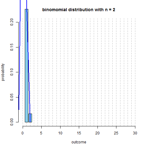
```text only n = 10 p = 0.13 max.n = 30 x = seq(1, min(n, max.n)) fx = dbinom(x=x, size=n, prob=p) plot(x=NULL, y=NULL, xlim=c(0, max.n), ylim=c(0, 0.2), main=paste(“binomomial distribution with n =”, n), ylab=”probability”, xlab=”outcome”, axes=F)
axis(side=1); axis(side=2)
bar.width = 0.4 par(xpd=NA) rect(xleft=x-bar.width, xright=x+bar.width, ybottom=0, ytop=fx, col=’skyblue’)
<img src="http://habrastorage.org/files/611/97f/732/61197f732d2a4cd6b1c65a2b2bc8ab8e.png" alt="Image">

```scdoc
fn = dnorm(x=c(-1, 0, 1, x), mean=n*p, sd=sqrt(n*p*(1-p)))
xspline(x=c(-1, 0, 1, x), y=fn, lwd=2, shape=1, border="blue")

Animation
```tera term macro require(animation)
saveGIF({ for (n in 2:130) { x = seq(1, min(n, max.n)) fx = dbinom(x=x, size=n, prob=p)
plot(x=NULL, y=NULL, xlim=c(0, max.n), ylim=c(0, 0.2),
     main=paste("binomomial distribution with n =", n),
     ylab="probability", xlab="outcome", axes=F)

par(xpd=FALSE)
abline(v=0:30, col='grey', lty=2)
axis(side=1); axis(side=2)

par(xpd=NA)
bar.width = 0.4
rect(xleft=x-bar.width, xright=x+bar.width,
     ybottom=0, ytop=fx, col='skyblue')

fn = dnorm(x=c(-1, 0, 1, x), mean=n*p, sd=sqrt(n*p*(1-p)))
xspline(x=c(-1, 0, 1, x), y=fn, lwd=2, shape=1, border="blue")   } }, interval=0.1) ```
Note:
par(xpd=NA)- to allow to draw outside of the main regionpar(xpd=FALSE)- to disallow to draw outside of the main region