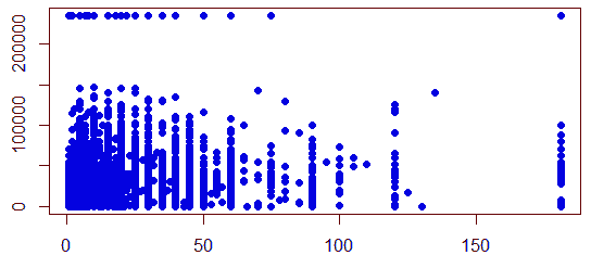
Scatter Plot
This is a Plot that can be useful for initial analysis of the data
- it uses Cartesian coordinates to visualize relationships between variables
- So, useful for Bivariate Analysis
plot(pData$JWMNP, pData$WAGP, pch=19, col="blue")
Tips and Tricks
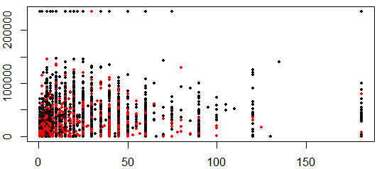
More Variables
What if we want to include one more variable?
- use color coding
- e.g. can encode sex in color
plot(pData$JWMNP, pData$WAGP, pch=19, col=pData$SEX, cex=0.5)
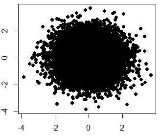
Lots of Data
How to visualize when there are many data points in your data?
x = rnorm(10000)
y = rnorm(10000)
plot(x, y, pch=19)
- not very visible
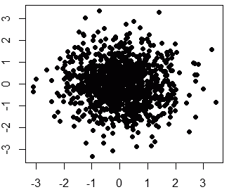
Sampling
Sample you data
- and plot just the part
sampledValues = sample(1:10000, size=1000, replace=F)
plot(x[sampledValues], y[sampledValues], pch=19)
Showing Density
- how to show the density of some area?
smoothScatter(x, y)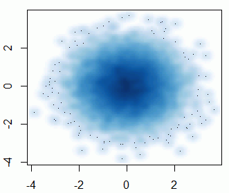
Sources
- Data Analysis (coursera)
- http://en.wikipedia.org/wiki/Scatter_plot