Box Plot
Box Plot
- This is a Plot that can be useful for Exploratory Data Analysis
- This plot is a visualization of Summary Statistics
- it’s “a convenient way of graphically depicting groups of numerical data through their quartiles”
General idea:
- What is Distribution of data?
- is it compact? symmetric?
- Are there Outliers?
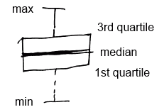
- IQR = Q3 - Q1 - the length of the box
- whiskers (fences) capture data outside of the box
boxplot(..., range=0, ...)
boxplot(..., horizontal=T, ...) // horizontal boxplot
range=0 means that it will show usual box plot.
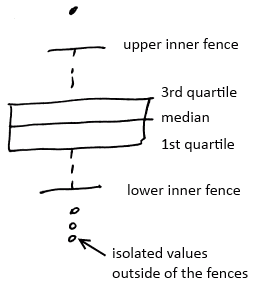
Modified Box Plot
Modified box plot can be used to show Outliers
- IQR (Inter Quartile Range) - difference between 3rd and 1st quartile
- Inner fences - the values that are 1.5 times the IQR beyond the 1st and 3rd quartile
- Lower inner fence = 1st quartile - (1.5 x IQR)
- Upper inner fence = 3rd quartile + (1.5 x IQR)
- observations beyond the whiskers (fences) are outliers and marked with dots
In R
- by default
boxplotshows modified box plot IQR(data)shows the IQR
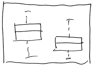
Bivariate Analysis
We can calculate all 5 number values for all quantitative variables associated with a specific category.
- And for each category get a box plot
- With box plots, we also can see how two values interact
R
boxplot(d$a ~ as.factor(d$f))
- it will show separate boxplot of values in $a$ for each values of $f$
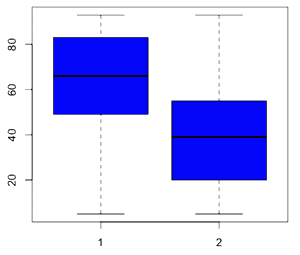
boxplot(d$a ~ as.factor(d$f), col=c("blue","orange"), names=c("yes","no"), varwidth=T)
- if we want to show how much data is there for each factor,
- we can make the with of the boxes proportional to the volume of data
- using
varwidth=T 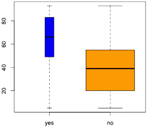
Box Plot with Other Plots
Box plots are nice to combine with other plots
- for example, with a Scatter Plot
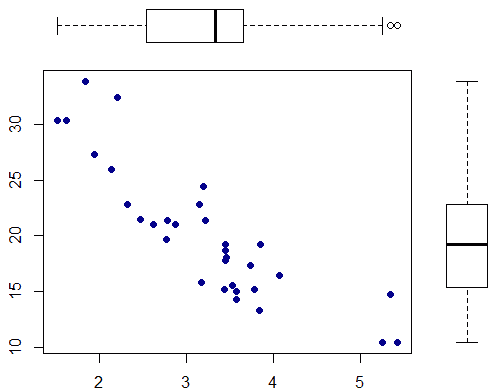 link
link- This is the R snipped to produce this figure
See Also
Sources
- Statistics: Making Sense of Data (coursera)
- Data Analysis (coursera)
- http://en.wikipedia.org/wiki/Box_plot