Cumulative Gain Chart
Gain Charts are used for Evaluation of Binary Classifiers
- also it can be used for comparing two or more binary classifiers
- the chart shows $\text{tpr}$ vs $\text{sup}$
Motivating Example
Suppose we have a direct marketing campaign
- population is very big
- we want to select only a fraction of the population for marketing - those that are likely to respond
- we build a model that scores receivers - assigns probability that he will reply
- want to evaluate the performance of this model
Cumulative Gain
Performance evaluation
- recall values that can be calculated for Evaluation of Binary Classifiers
- accuracy - but it’s not enough here
- $\text{tpr}$ - True Positive Rate or Sensitivity
- $\text{tpr} = \cfrac{\text{TP}}{\text{TP} + \text{FN}}$
- fraction of examples correctly classified
- $\text{sup}$ - Support (Predictive Positive Rate)
- $\text{sup} = \cfrac{\text{TP} + \text{FP}}{N} = \cfrac{\text{predicted pos}}{\text{total}}$
- fraction of positively predicted examples
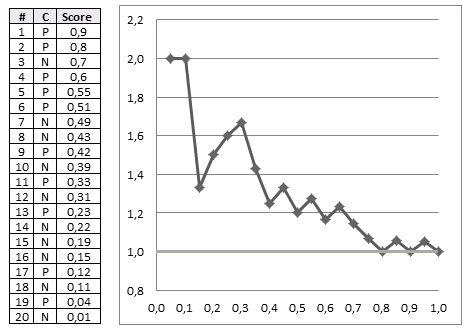
Suppose that we obtained the following data:
- Cls = actual class
- score = predicted score
| | Cls | Score | N | 0.01 || P | 0.51 || N | 0.49 || P | 0.55 || P | 0.42 || N | 0.7 || P | 0.23 || N | 0.39 || P | 0.04 || N | 0.19 || P | 0.12 || N | 0.15 || N | 0.43 || P | 0.33 || N | 0.22 || N | 0.11 || N | 0.31 || P | 0.8 || P | 0.9 || P | 0.6 | | $\Rightarrow$ sort $\Rightarrow$ | | # | Cls | Score | 1 | P | 0.9 || 2 | P | 0.8 || 3 | N | 0.7 || 4 | P | 0.6 || 5 | P | 0.55 || 6 | P | 0.51 || 7 | N | 0.49 || 8 | N | 0.43 || 9 | P | 0.42 || 10 | N | 0.39 || 11 | P | 0.33 || 12 | N | 0.31 || 13 | P | 0.23 || 14 | N | 0.22 || 15 | N | 0.19 || 16 | N | 0.15 || 17 | P | 0.12 || 18 | N | 0.11 || 19 | P | 0.04 || 20 | N | 0.01 | | - sort the table by score desc - max on top, min at bottom - if model works well, expect - responders at top - non-responders at bottom - the better the model - the clearer the separation - between positive and negative |
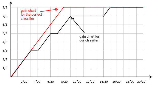
Intuition
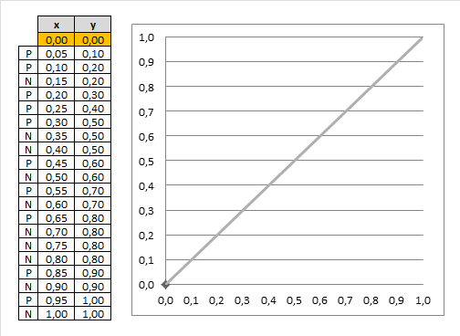
- suppose now we select top 20% records
- we see that out of 4 examples 3 of them are positive
- in total, there are 10 responders (positive classes)
- so with only 20% (4 records) we can target 3/10 = 30% responders
- we also can use a random model
- if you randomly sample 20% of records, you can expect to target only 20% your responders
- 20% of 10 = 2
- so we’re doing better than random
- can do it for all possible fractions of our data set and get this chart:
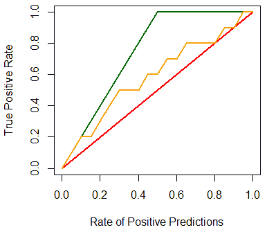
Best classifier
- the optimal classifier will score positives and negatives s.t. there’s a clear separation between them
- in such a case the gain chart will always go up until it reaches 1, and then go left
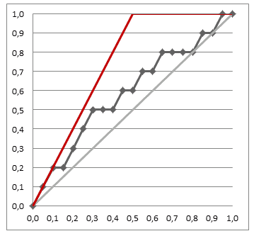
- the closer our chart to the best one, the better our classifier is
Gain Chart
So a gain chart shows
- Predicted Positive Rate (or support of the classifier)
- vs True Positive Rate (or sensitivity of the classifier)
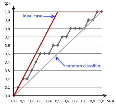
- it says how much population we should sample to get the desired sensitivity of our classifier
- i.e. if we want to direct 40% of potential repliers to our targeting campaign, we should select 20%
- when we divide our data into two subsets, we can plot the charts for both
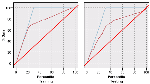
- we can easily see if a classifier overfits on the test set, but underperforms on the testing
Examples
Given
- 20 training examples, 12 negative and 8 positive
| | # | Cls | Score | 1 | N | 0.18 || 2 | N | 0.24 || 3 | N | 0.32 || 4 | N | 0.33 || 5 | N | 0.4 || 6 | N | 0.53 || 7 | N | 0.58 || 8 | N | 0.59 || 9 | N | 0.6 || 10 | N | 0.7 || 11 | N | 0.75 || 12 | N | 0.85 || 13 | P | 0.52 || 14 | P | 0.72 || 15 | P | 0.73 || 16 | P | 0.79 || 17 | P | 0.82 || 18 | P | 0.88 || 19 | P | 0.9 || 20 | P | 0.92 | | $\Rightarrow$ sort(score) | | # | Cls | Score | 20 | P | 0.92 || 19 | P | 0.9 || 18 | P | 0.88 || 12 | N | 0.85 || 17 | P | 0.82 || 16 | P | 0.79 || 11 | N | 0.75 || 15 | P | 0.73 || 14 | P | 0.72 || 10 | N | 0.7 || 9 | N | 0.6 || 8 | N | 0.59 || 7 | N | 0.58 || 6 | N | 0.53 || 13 | P | 0.52 || 5 | N | 0.4 || 4 | N | 0.33 || 3 | N | 0.32 || 2 | N | 0.24 || 1 | N | 0.18 | |
Comparing Binary Classifiers
Can draw two or more gain charts over the same plot
- and thus be able to compare two or more classifiers
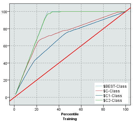
- we see that one of the classifiers most likely overfits the training data
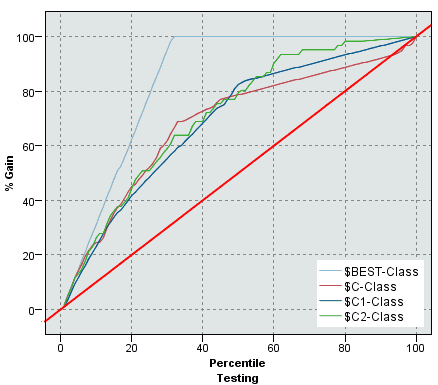
- but when we test, we see that it performs as good (bas) as other classfiers
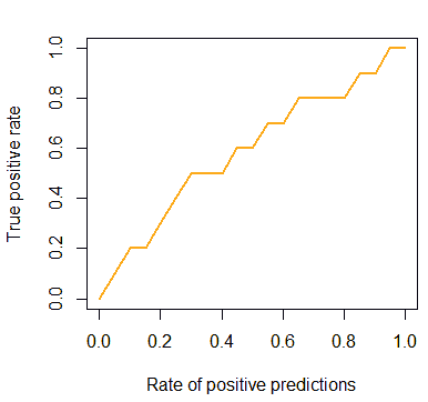
Plotting Gain Chart in R
In R there’s a package called ROCR [(for drawing ROC Curves(ROC_Analysis))
install.packages('ROCR')
require('ROCR')
It can be used for drawing gain charts as well:
cls = c('P', 'P', 'N', 'P', 'P', 'P', 'N', 'N', 'P', 'N', 'P',
        'N', 'P', 'N', 'N', 'N', 'P', 'N', 'P', 'N')
score = c(0.9, 0.8, 0.7, 0.6, 0.55, 0.51, 0.49, 0.43,
          0.42, 0.39, 0.33, 0.31, 0.23, 0.22, 0.19,
          0.15, 0.12, 0.11, 0.04, 0.01)

pred = prediction(score, cls)
gain = performance(pred, "tpr", "rpp")

plot(gain, col="orange", lwd=2)
But we also can add the baseline and the ideal line:
plot(x=c(0, 1), y=c(0, 1), type="l", col="red", lwd=2,
     ylab="True Positive Rate",
     xlab="Rate of Positive Predictions")
lines(x=c(0, 0.5, 1), y=c(0, 1, 1), col="darkgreen", lwd=2)

gain.x = unlist(slot(gain, 'x.values'))
gain.y = unlist(slot(gain, 'y.values'))

lines(x=gain.x, y=gain.y, col="orange", lwd=2)
Cumulative Lift Chart
Lift charts show basically the same information as Gain charts
- $\text{ppr}$ Predicted Positive Rate (or support of the classifier)
- vs $\cfrac{\text{tpr}}{\text{ppr}}$ True Positive over Predicted Positive